Typography is more than just choosing a beautiful font; it’s the foundation of how we read, interact, and experience information across media. From the printed pages of a novel to the pixels lighting up our phone screens, each character’s size, spacing, and alignment are governed by intricate measurements.
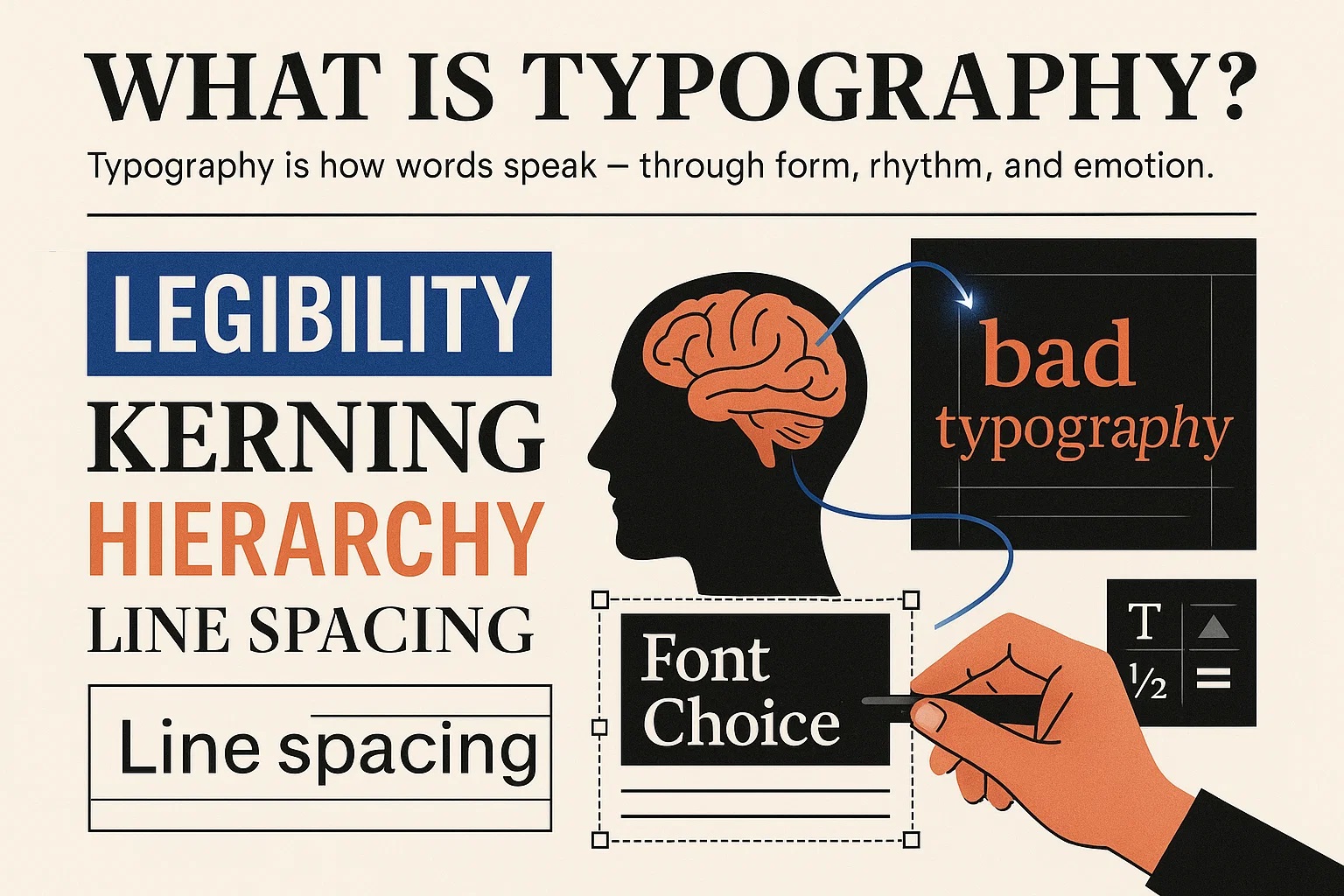
What Is Typography?
At its core, typography is the art and science of arranging type to make text not just readable, but visually engaging and meaningful. It includes choosing typefaces, adjusting sizes, setting line heights, refining kerning (letter spacing), and orchestrating every design element that influences how we interact with text.
But typography isn’t only technical — it has emotional power. Research from MIT’s AgeLab has shown that typeface choices can significantly impact a reader’s attention, emotional response, and engagement. Thoughtful, clean typography enhances understanding, builds trust, and even influences our decisions without us realizing it.
Fun Fact: Early typesetters used physical “em squares” — based on the width of the letter "M" — to measure spacing. This tradition continues in digital design, where units like em and rem are still used in CSS.
Bringing digital typography into the physical world, such as signage or engraving, isn’t just about matching fonts visually. The pressure used must be precise to preserve detail. Our Force Converter helps ensure accurate measurements when working with physical materials.
Typography Measurement Units
Typography has transitioned from the rigid mechanics of traditional printing presses to the fluid, screen-based systems of modern design. Each unit of measurement carries historical context and technical nuance — knowing how they relate and convert is vital for designers, developers, and publishers alike.
Traditional Print Units
-
Point (pt): Commonly used to measure font size and line spacing. Today, 1 point equals exactly 1/72 of an inch in the PostScript system.
-
Pica: Used heavily in publishing, 1 pica equals 12 points, and there are 6 picas in 1 inch.
-
Inch (in): Often used in large-format print layouts like newspapers and posters. While less common in screen typography, it’s still relevant for physical sizing.
Digital Typography Units
-
Pixel (px): Represents the smallest visible unit on a screen. Because devices vary in pixel density (DPI or PPI), actual pixel size can differ between screens.
-
Em & En: Scalable units in digital typography. One em is equal to the current font size; an en is half that. They're useful for responsive, accessible designs.
-
Twip: Short for "twentieth of a point," this unit was used in early word processors like Microsoft Word.
1 twip = 1/20 point = 1/1440 inch. -
Character Width (X) & Height (Y): These units measure the dimensions of glyphs, especially in monospaced fonts or older layout systems.
Helvetica: The Typeface That Defined a Generation
After World War II, Europe was rebuilding — and so was its visual language. In 1957, Swiss designer Max Miedinger, alongside Eduard Hoffmann at the Haas Type Foundry, introduced Helvetica (originally named Neue Haas Grotesk) to the world.
With its sleek, neutral form and consistent spacing, Helvetica quickly became the face of modernism. It was more than a typeface — it was a design revolution. Global brands like BMW, American Airlines, and Lufthansa embraced it, using Helvetica to communicate trust, clarity, and forward-thinking values.
Its impact was so enduring that in 2007, Helvetica was the subject of a full-length documentary celebrating its role in shaping modern design.

Typography That Adapts
How text looks on the page is just the start. The real power of typography lies in how it adapts across devices, platforms, and materials. Whether you're coding for responsive websites or prepping a design for physical production, using the right measurement units and conversion tools is essential.
Head over to our Conversion section to make accurate unit switches fast and simple — no guesswork needed.
Check out Conversion section for automatic conversion, fast and easy